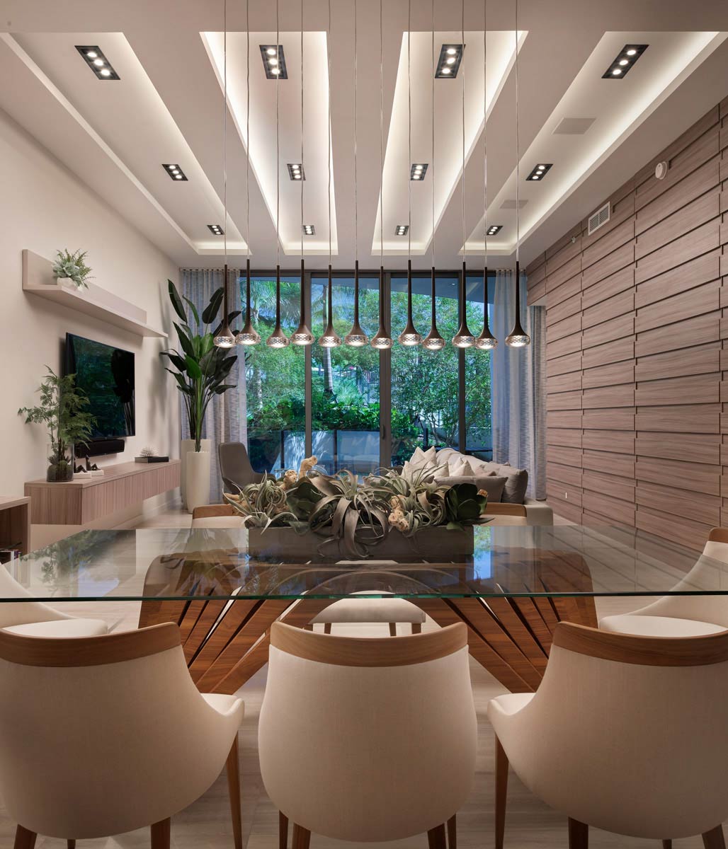
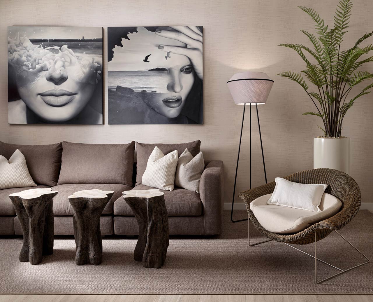
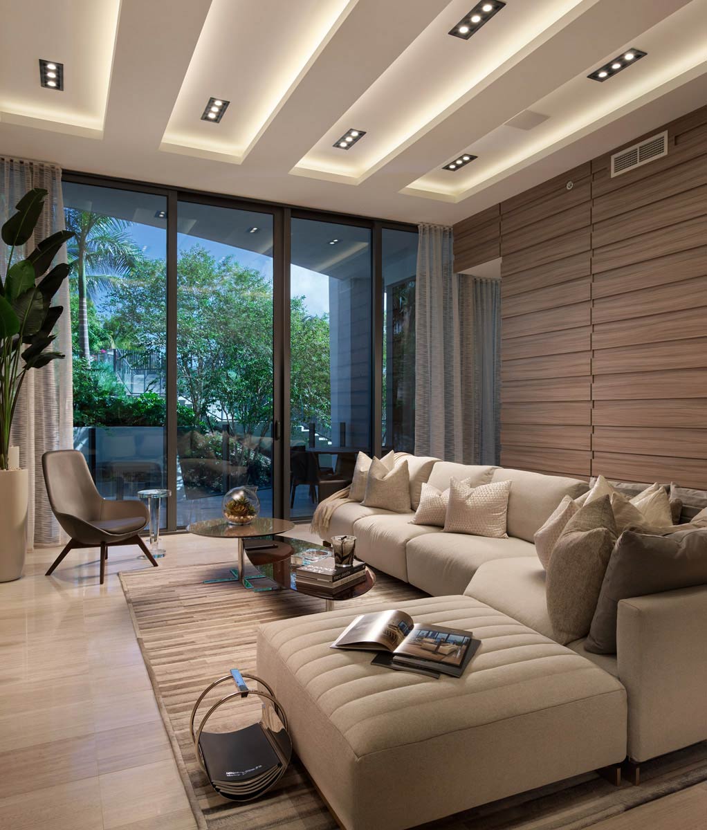
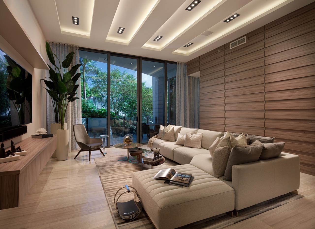
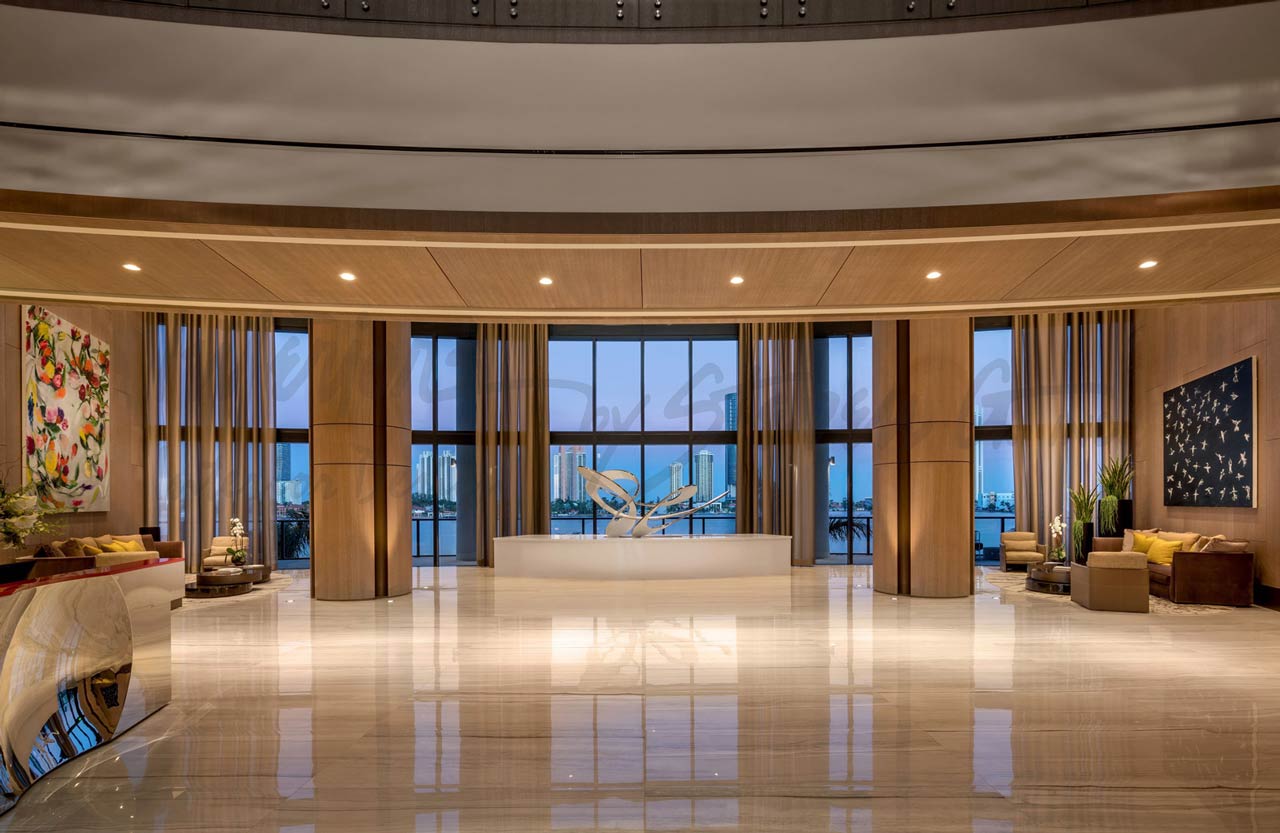
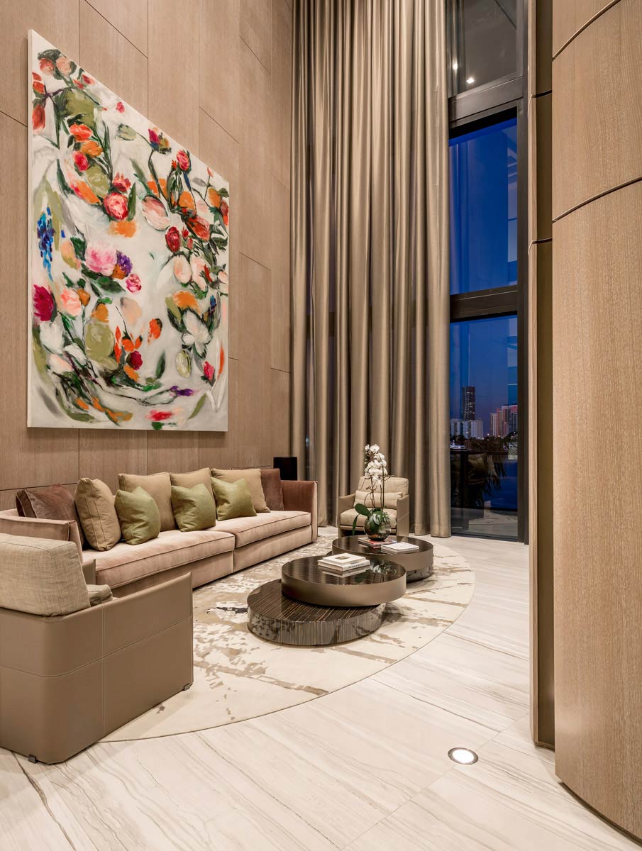
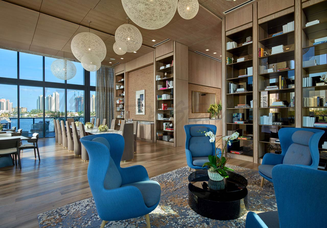
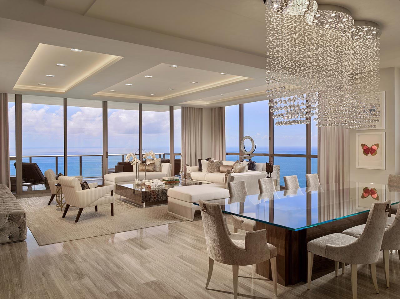
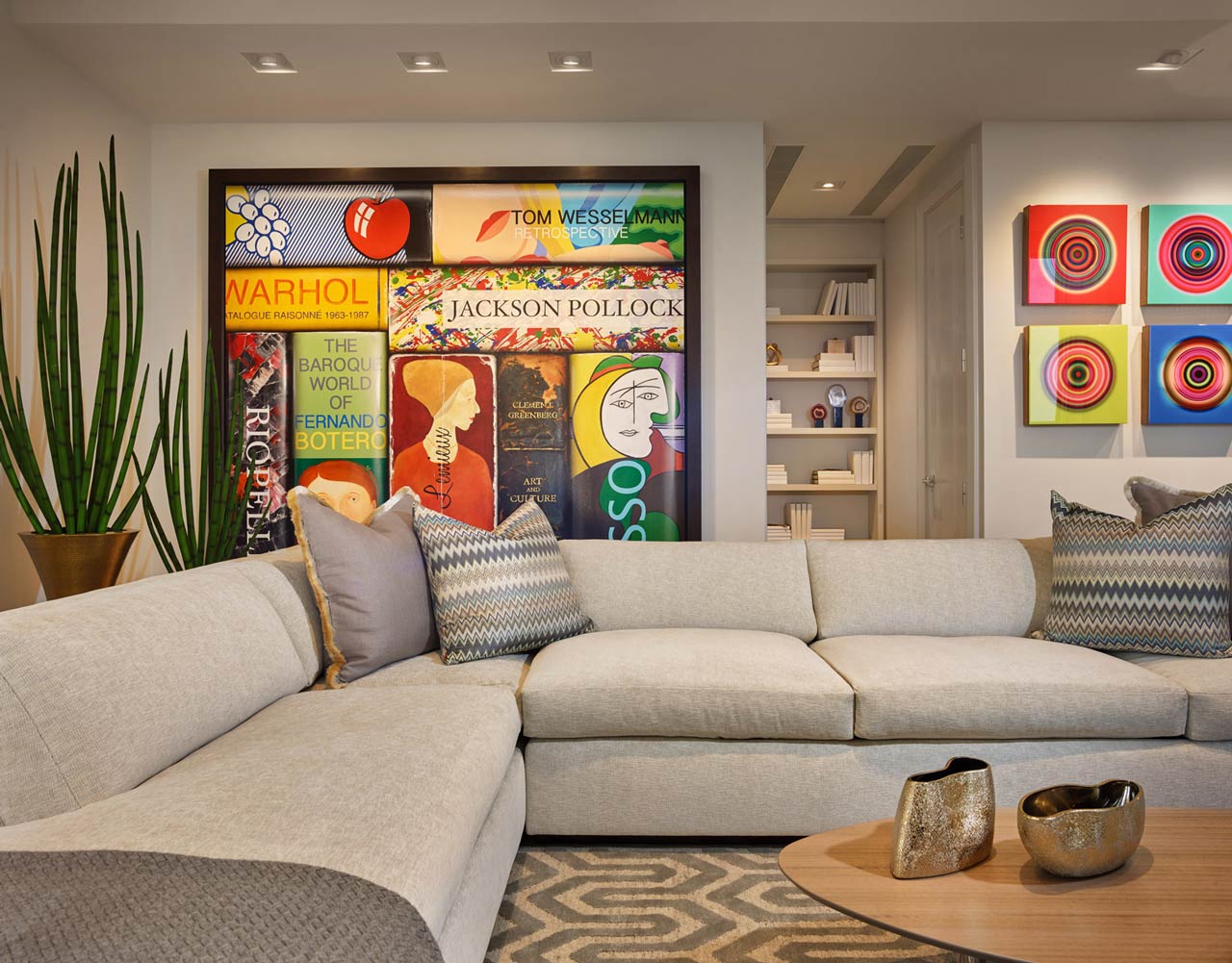
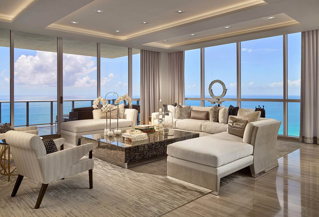
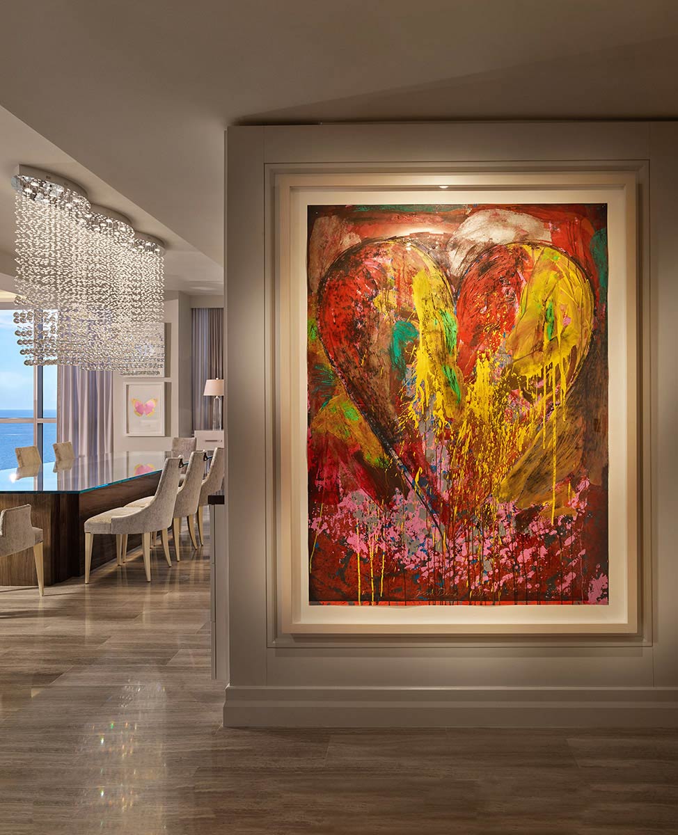
Colors in interior design help reflect personal style and tie various features together or decor pieces. Choosing a suitable color palette involves several steps, from defining the overall style to testing paint samples. Interiors by Steven G. has an experienced team of interior designers South Florida residents can work with to execute their vision. Here are eight tips for choosing the right color scheme for your interior design project:

1. Define the Style

Determine the style or theme for the space to help guide color choices and overall design direction. Our design expertise at Interiors by Steven G. focuses on contemporary, traditional, and transitional styles. A contemporary style uses more neutral palettes and varied textures, while traditional design incorporates darker colors and classic elements. We can also blend traditional and contemporary components to create a unique transitional design.

2. Choose the Mood

Color psychology suggests that different colors canĀ evoke certain emotions. This concept makes choosing the right color palette beneficial for creating a mood that fits the project’s purpose and design. Cool colors like blues and greens tend to create a calming and relaxing atmosphere, suitable for bedrooms or areas where you want to promote tranquility. Warm colors like reds and oranges add energy and warmth, which is ideal for social spaces like living rooms or dining areas.

3. Assess Natural Light

Natural light may affect how colors appear in a room. Lighter colors reflect more light, making a space feel brighter and more expansive. Darker colors absorb light to create a cozy or intimate atmosphere. Interior design projects may incorporate them to make an unusually large room feel smaller. Natural light also changes throughout the day, affecting how colors are perceived. Assess how the color palette looks during different times of the day, from morning to evening, to make sure the chosen colors maintain their desired effect under varying lighting conditions.

4. Coordinate With Existing Elements

Coordinating the color palette with existing elements such as furniture, flooring, fixtures, and structural features can create visual coherence in any space. The right colors help enhance the impact of existing architectural features or focal points. If you want to draw attention to a fireplace or a piece of artwork, use a complementary color to create an accent wall. This technique also adds depth and interest to the newly designed space. Choosing colors that clash with existing elements may disrupt the flow and balance of the room. Coordinating colors makes sure the different elements work together cohesively, preventing visual discord and creating a more pleasing environment.

5. Use the 60-30-10 Rule

When following theĀ 60-30-10 rule, 60 percent of the room should use the primary color, 30 percent should be dedicated to a secondary color, and the final 10 percent should be used as an accent color. This balanced distribution prevents one shade from overpowering the room. Following the 60-30-10 rule simplifies the color selection process by providing clear guidelines on how to distribute colors effectively. It prevents the palette from becoming overwhelming or chaotic, resulting in a more cohesive and well-designed interior. Our designers can adjust this percentage slightly based on the space’s specific requirements and the desired visual impact. This flexibility confirms that the color palette remains tailored to your individual project preferences while maintaining balance and harmony.

6. Create a Mood Board

A mood board visually represents the overall design concept of your project, including color schemes, textures, patterns, and decorative elements. It allows you to see how different elements come together, providing a clear picture of the desired aesthetic. You can experiment with various color combinations, evaluate their interaction, and decide which colors work best together. Mood boards aid in developing and refining the theme or style of the interior design project. Whether it’s a modern or traditional theme, the mood board helps capture the essence of the chosen style through color swatches, fabric samples, and other visual elements.

7. Test Paint Samples

Paint colors can appear differently on walls than on a paint chip or in a digital image. Testing paint samples allows you to see the true color in the actual lighting conditions of the room, confirming color accuracy before making a final decision. It may also help you identify subtle undertones in the colors that weren’t apparent initially. This lets you determine if they complement or clash with other elements in the room, such as furniture, flooring, and decor.

8. Assess the Flow

If your design project involves multiple rooms or an open-concept space, make sure that the color palette flows well from one area to another. Assessing the flow helps maintain visual continuity and cohesion throughout the space. Choose coordinating colors or variations of the same hue to create a unified look. Pay attention to transition zones such as hallways, corridors, and entryways. These areas should flow seamlessly with the adjacent rooms, using complementary colors or shades of the primary color to create a smooth transition.

Interior Designers South Florida Can Rely On

Professional interior designers have extensive knowledge and experience in color theory and design principles. They can provide valuable insights for choosing the right colors to achieve the desired mood, ambiance, and aesthetic appeal. At Interiors by Steven G., we assist our clients with creating spaces that reflect their lifestyles and personalities. Contact our team today to view our portfolio and learn more about our luxury design services.